 Alana Appel
Alana Appel
Alana Appel
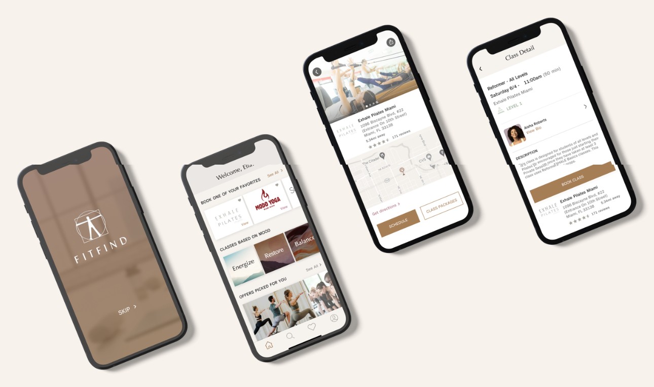
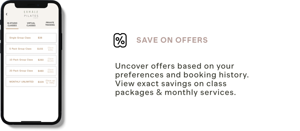
The FITFIND app is a new approach to finding fitness studios anywhere. Users can customize their current routine while saving time & money. The app also allows them to save on offers, connect with others in their community, book and add multiple classes to the calendar with the tap of a button & explore classes based on mood.
I approached this project through a human-centered iterative process that focuses on the users’ main goals and pain points in order to come up with a viable solution to my chosen problem space. This non-linear, 5-stage iterative process is comprised of the following steps: Empathize, Define, Ideate, Prototype & Test.
The fitness industry was amongst the hardest hit during the global pandemic. As a result, several boutique fitness studios were closed for prolonged periods, while others were forced to shut their doors permanently. Customers of these studios are now eager to exercise in person again. Their experiences can be improved in many ways. I will examine how a fitness studio patron’s experience can be enhanced based on user needs. In reality, many customers’ fitness experiences fall short of their expectations.
Individuals wanting to improve their health through exercise have a difficult time finding where to go and take fitness classes due to a lack of awareness about the amount and type of studios that are open.
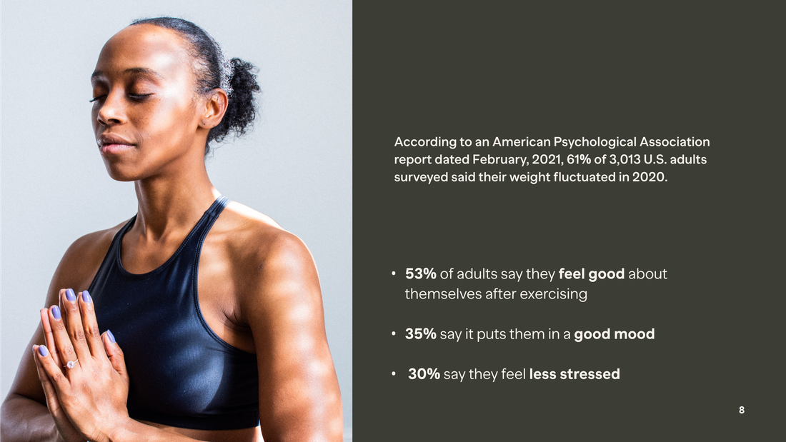
According to an American Psychological Association report dated February 2021, 61% of 3,013 U.S. adults surveyed said their weight fluctuated in 2020.
of people say in-person classes and appointments are better for their mental health than an at-home digital routine, and after a tough year, self-care is now more important than ever.
of adults say they feel good about themselves after exercising.
As one boutique studio owner, Kari Saitowitz, was quoted in the NY Times,
“People come here because of the conversation, the socialization, for the fun and motivation of a class.”
How might we help health-conscious individuals find and book physical studio classes, so they can exercise regularly in order to continue improving their health?
In order to place fitness studio patrons at the center of the user experience, I have conducted Qualitative & Quantitative research through interviews & analytics.
I interviewed 5 participants living in the US between the ages of 22-60.
I chose to focus on the US because it is the largest fitness market worldwide, not only in revenue (estimated at $30B) but also in the sheer number of gyms and fitness clubs.
Next, I divided their shared insights into themes: Well-being, Scheduling, Accountability & Expense.
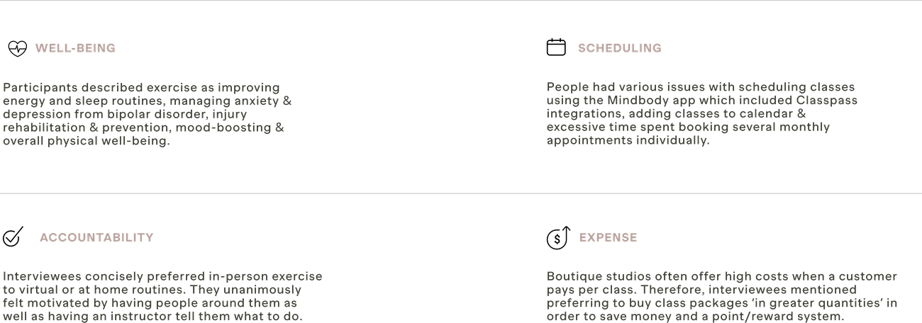
After looking at these themes, it became clear that 80% of interviewees chose to exercise due to both physical and mental benefits. Interviewees also concisely preferred in-person exercise to virtual or at-home routines.
Based on these insights, I next crafted a persona and experience map in order to identify interventions and opportunities in which to focus my digital solution. My primary persona is Ella Foster, a 37-year-old mental health therapist who works remotely. She is looking to resume her regular exercise routine post-pandemic in order to balance her own stress & mental health. Meet Ella:
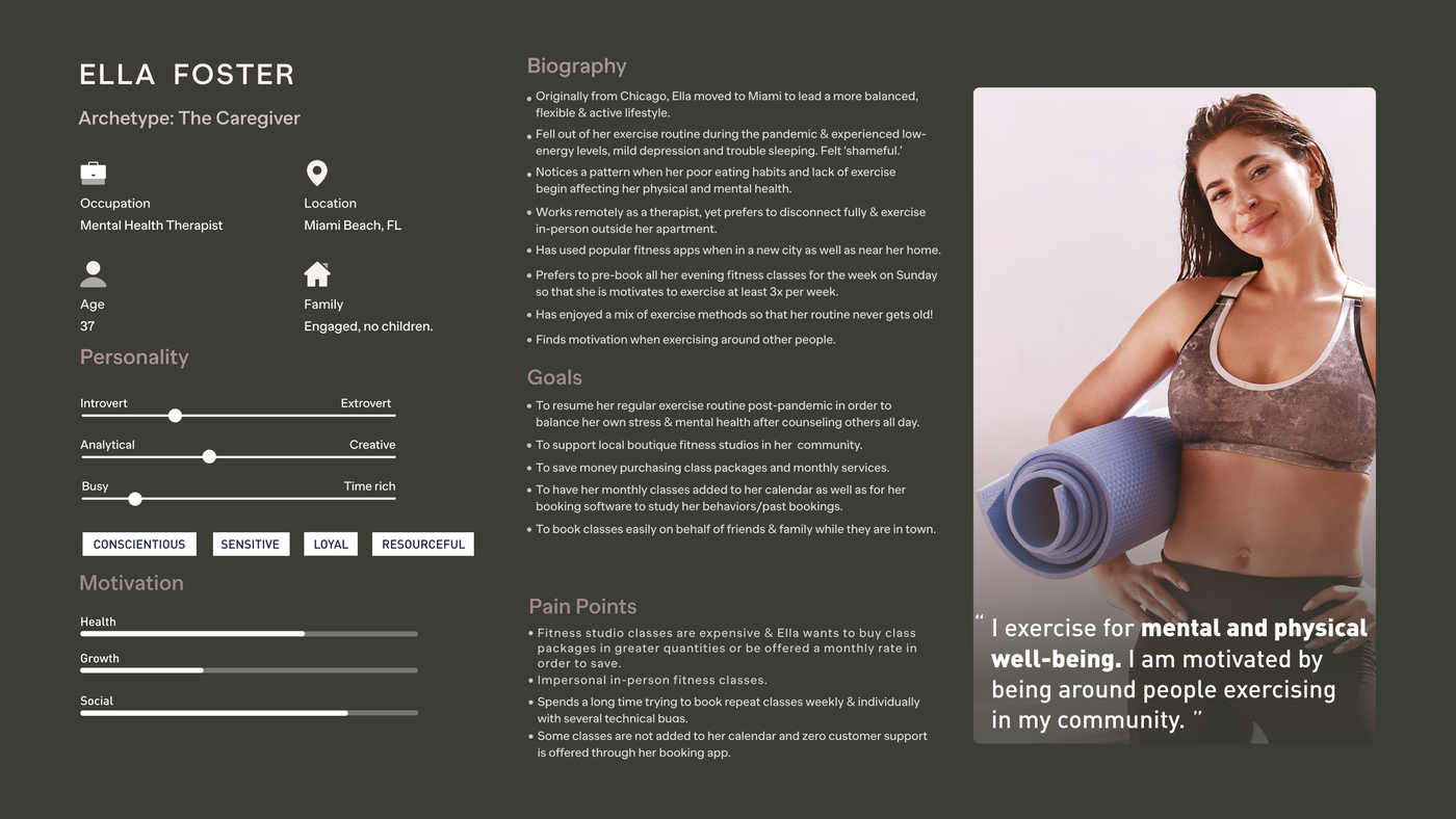
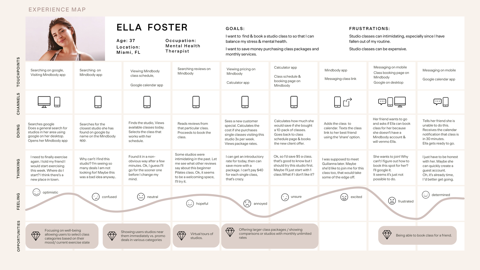
Based on the experience map, the below-identified opportunities address Ella’s personal goals. In particular, saving money purchasing class packages and monthly services and booking classes easily on behalf of friends & family would directly tie in with Ella’s goals and interview insights.
Next, I moved forward developing 30 user stories that apprehend our persona Ella’s functional needs based off of her original goals, pain points & motivations. I organized these user stories into 3 well-defined epics.
Of the 3 epics, I chose ‘More Efficient Booking.’ I chose this as my core epic because it contained the most compelling narrative and is crucial for my persona, Ella, to achieve her goal. I next expanded the user stories as shown below.
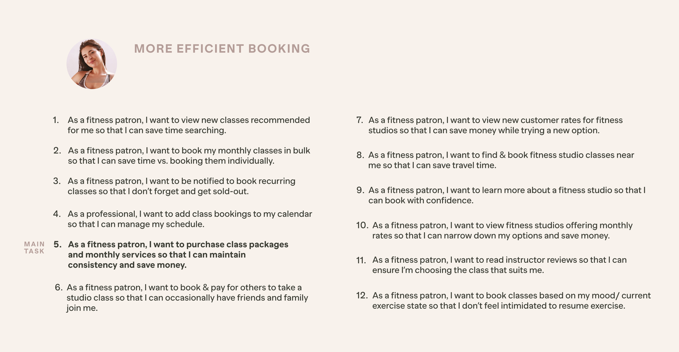
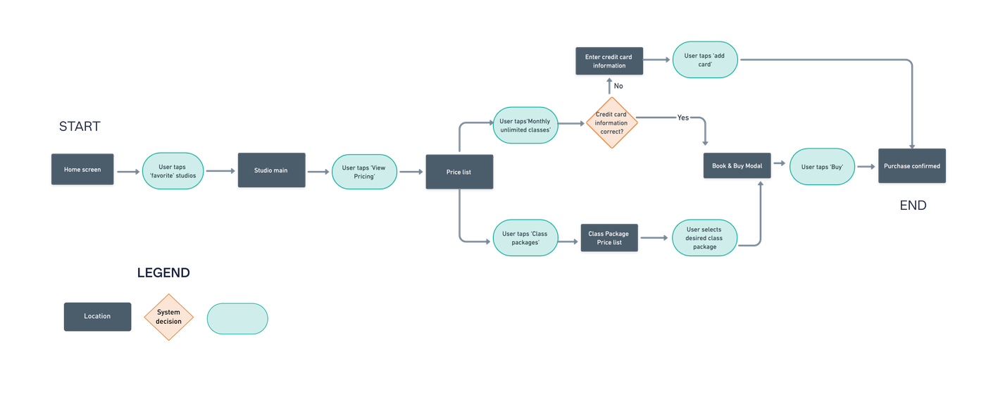
I deciphered the user stories into tasks by determining what the main task flow will be and what sub-tasks may support that flow. After identifying my main task, I developed a task flow visualizing the steps a user would encounter in order to purchase class packages & monthly services.
To design features and UI components that best execute the solution, I sourced inspiration from existing digital products such as Mindbody and Classpass, as well as the Rideshare app, Alto for the ‘Choose your Mood’ or Vibe element. I explored a range of ideas rapidly to ideate toward the first prototype.
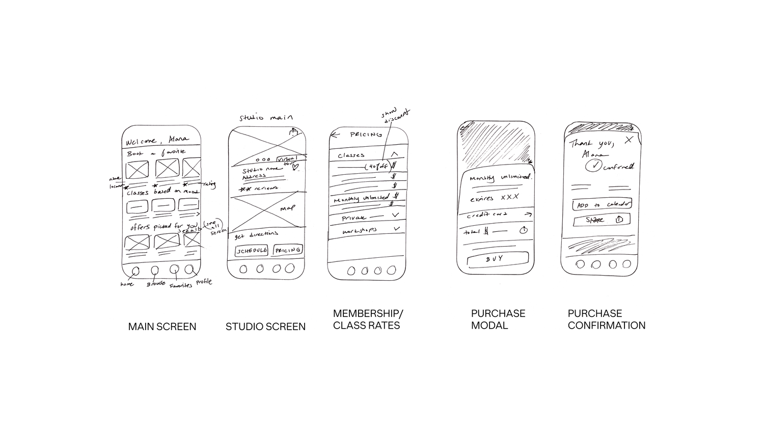
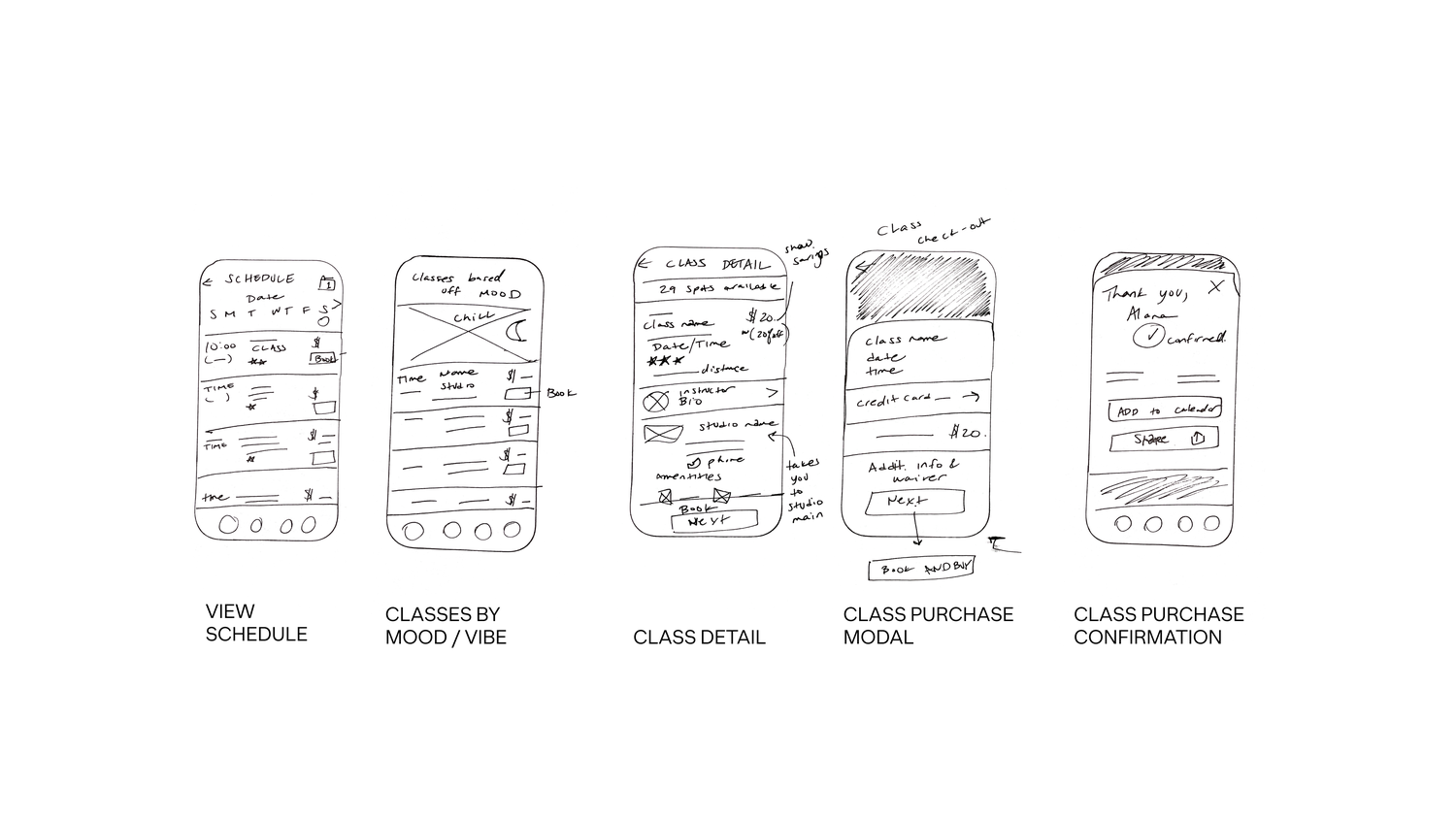
These early paper sketches guided the initial digital greyscale prototype for the first round of testing.
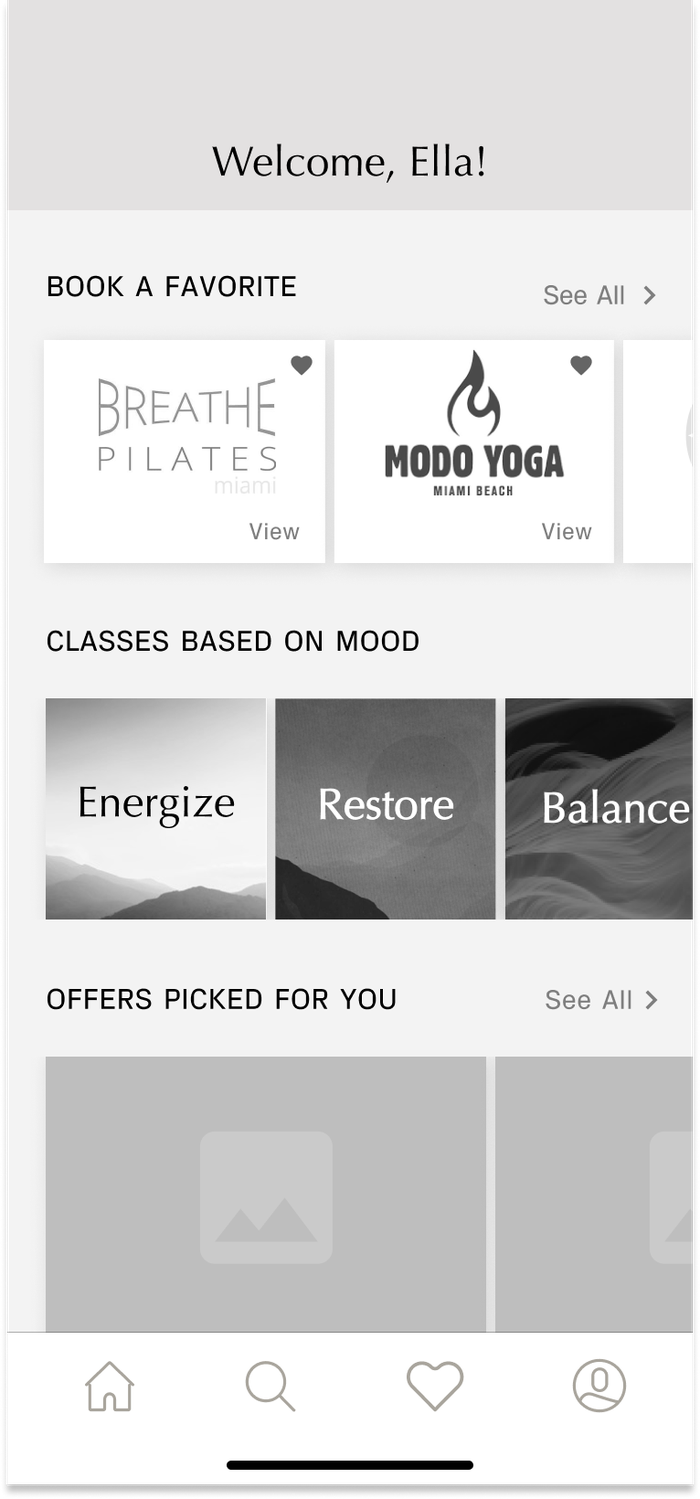
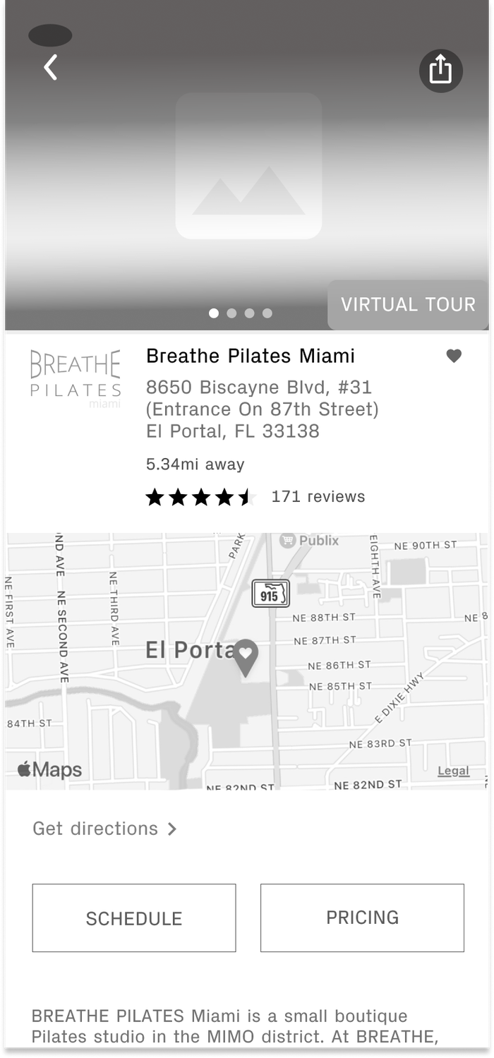
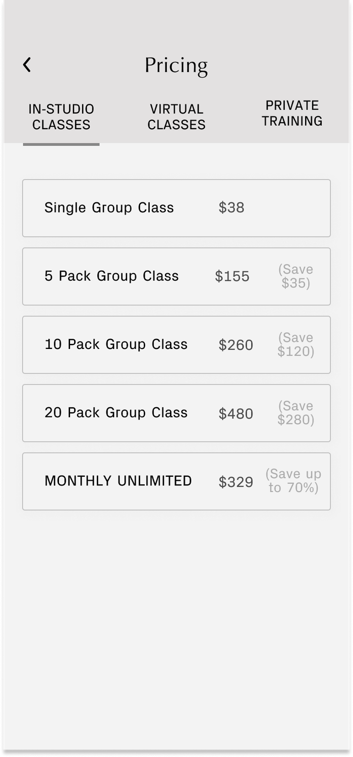
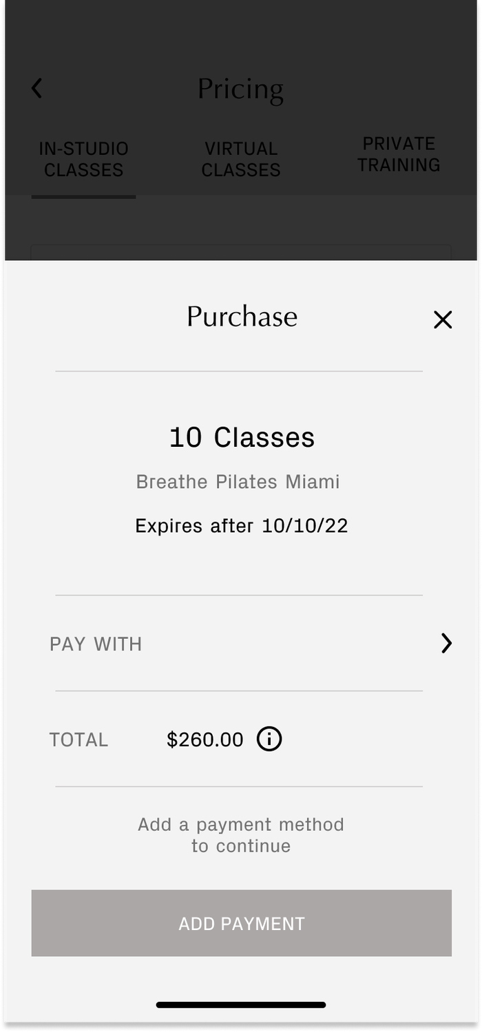
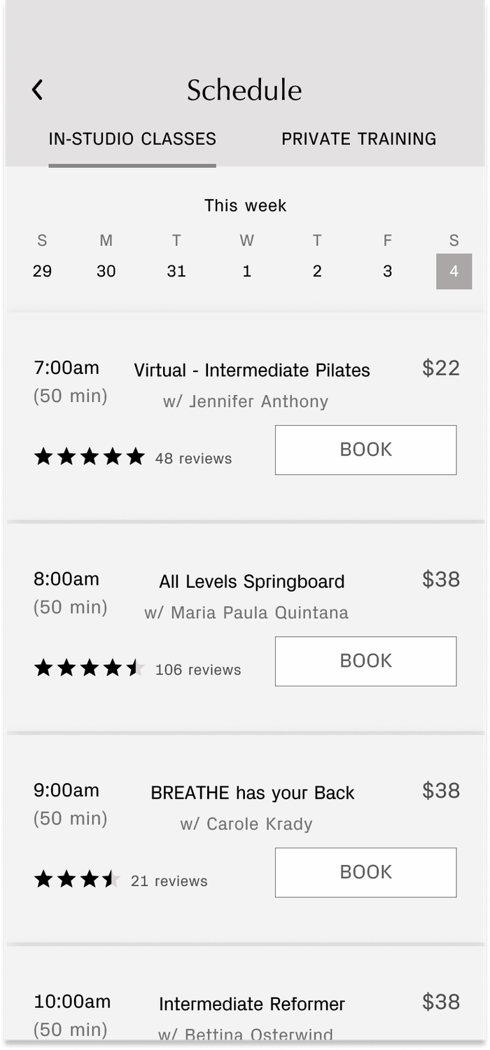
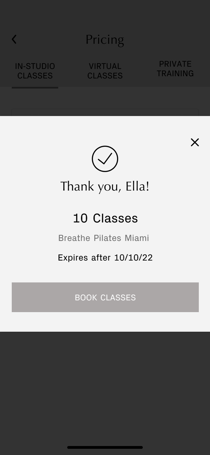
After going through the ideation process above for each screen, I created the first wire flow in mid-fidelity. This prototype underwent usability testing for two rounds with 5 participants in each round. Testers were given a set of 3 tasks to complete. Through this task analysis, I was able to gauge how users interacted with the app to ensure that it functions as intended.
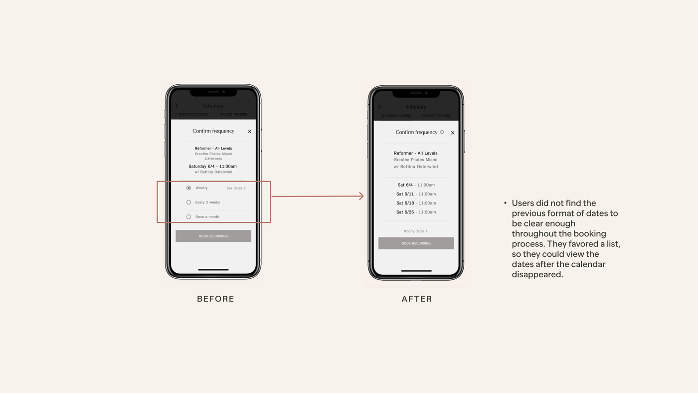
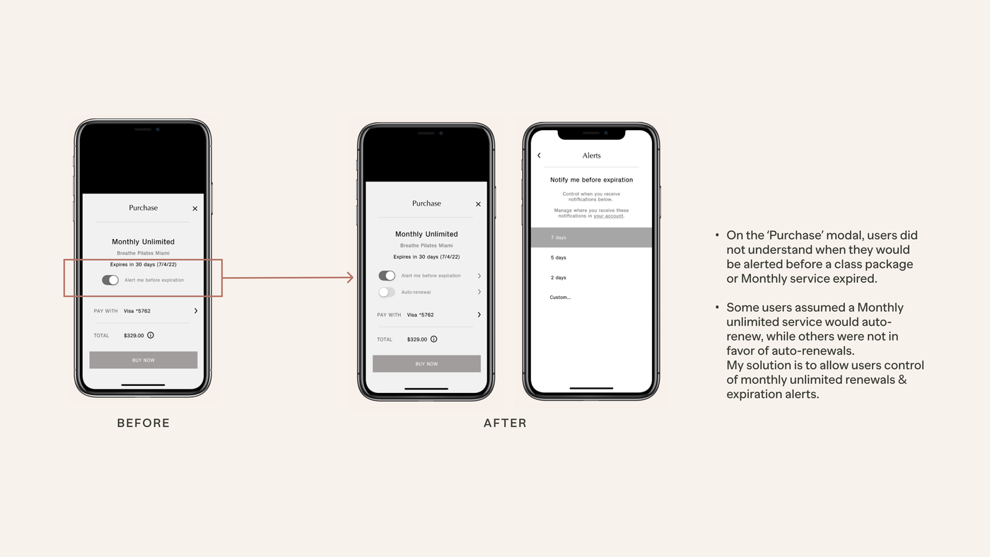
The results were insightful. 3/5 users were able to complete all tasks. There were areas that needed improvements such as language clarity and greater user control in terms of managing bookings and class expiration dates.
Based on design prioritization, I followed through with the following key revisions for the next set of greyscale prototypes:
View 2nd Prototype View 3rd Prototype
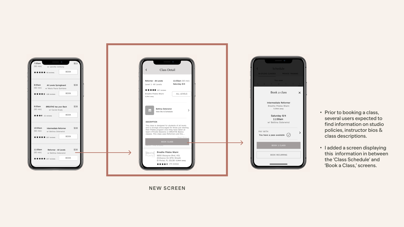
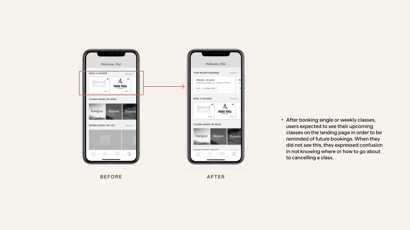
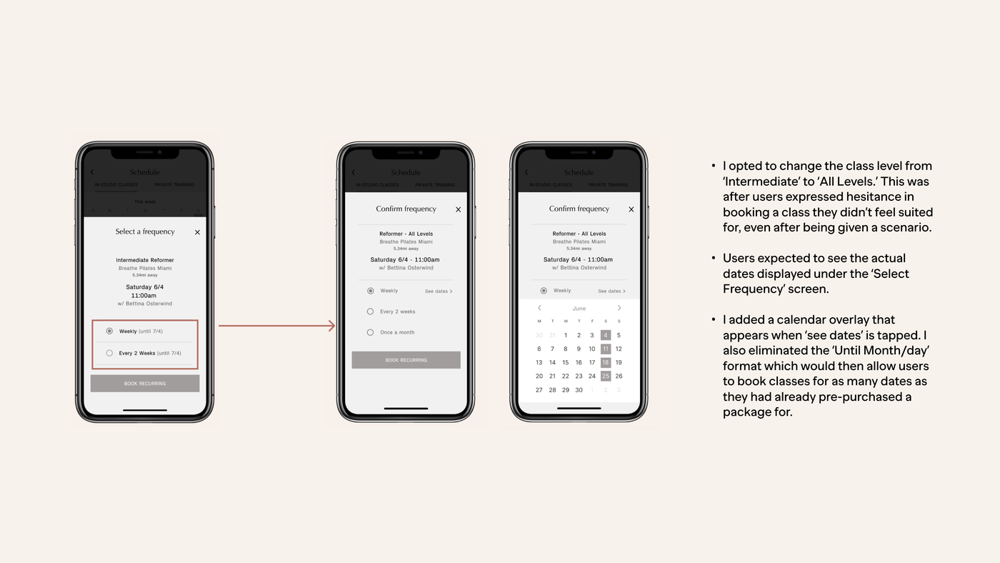
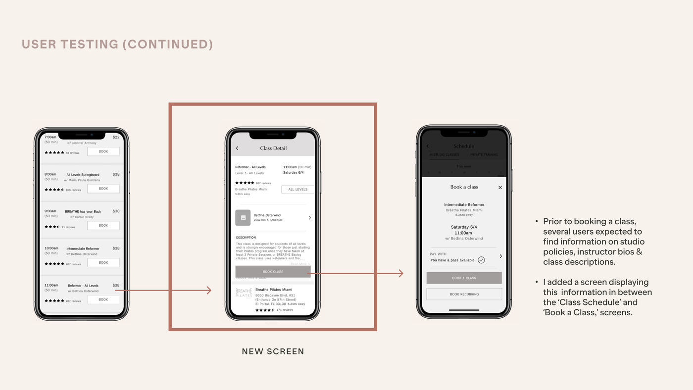
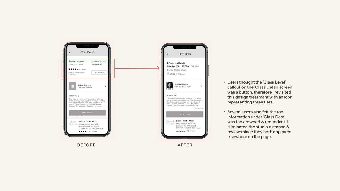
I took these iterations to Round 2 of usability testing and continued to iterate. Now, 5/5 users were able to complete all 3 tasks. However, there were a couple of areas that needed improvement in order to take the app to the next level.
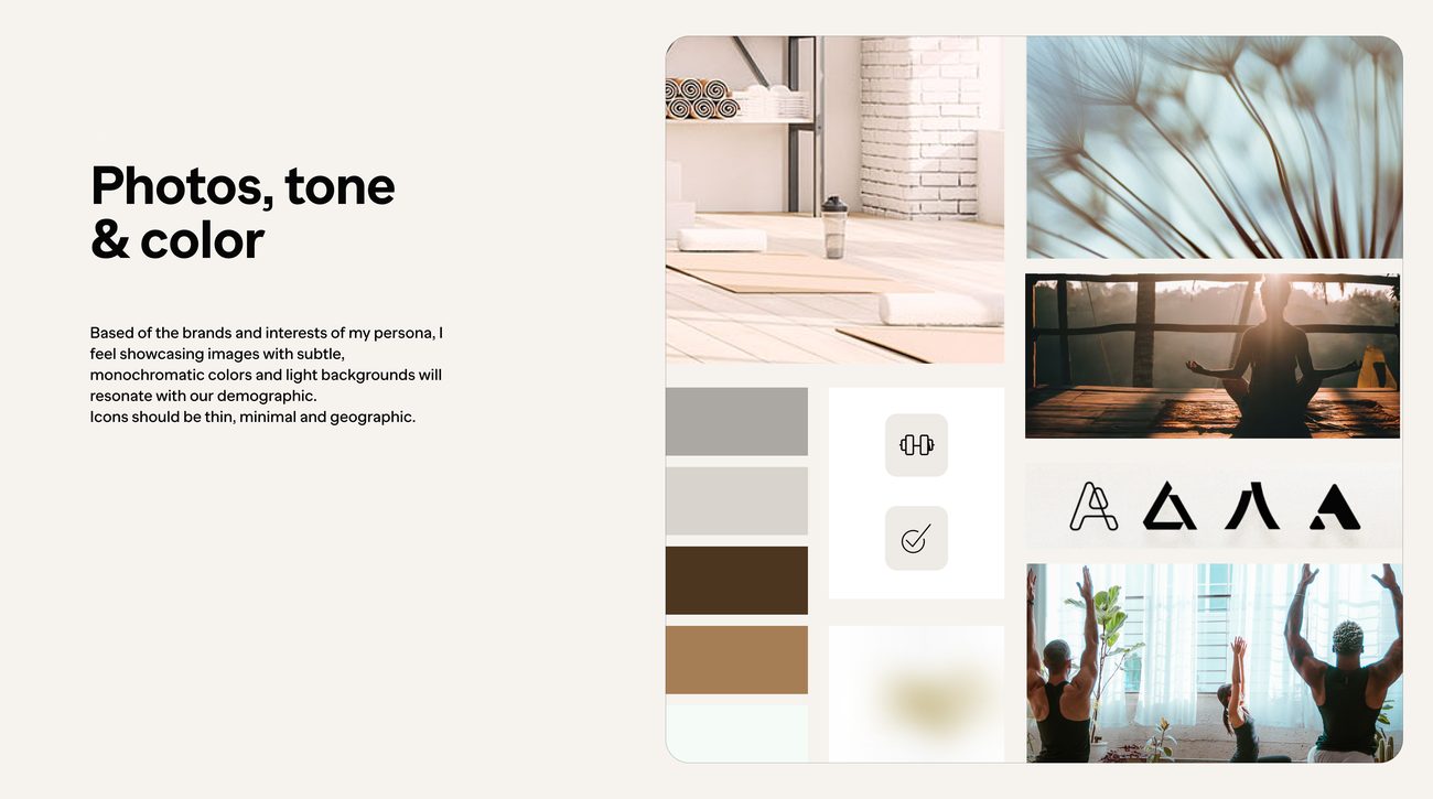
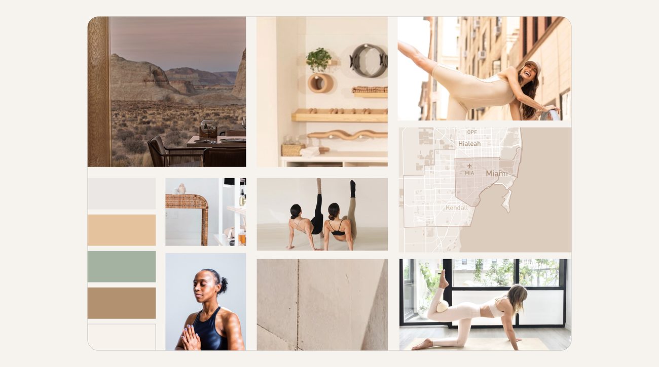
Now that my final flow of screens has been established, I began thinking about the visual identity of my brand prior to creating a high-fidelity prototype. Here are adjectives that my brand embodies.
As the next step in my brand development, I explored potential names that were appropriate. The two finalists were “FITFind” and “BeneFIT”.
I landed on ‘FITFIND’ because it defines the purpose & objectives of my digital product, as well as key brand characteristics to be communicated. ‘FITFIND’ also highlights the benefits of the services associated with my brand, which are physical & mental fitness.
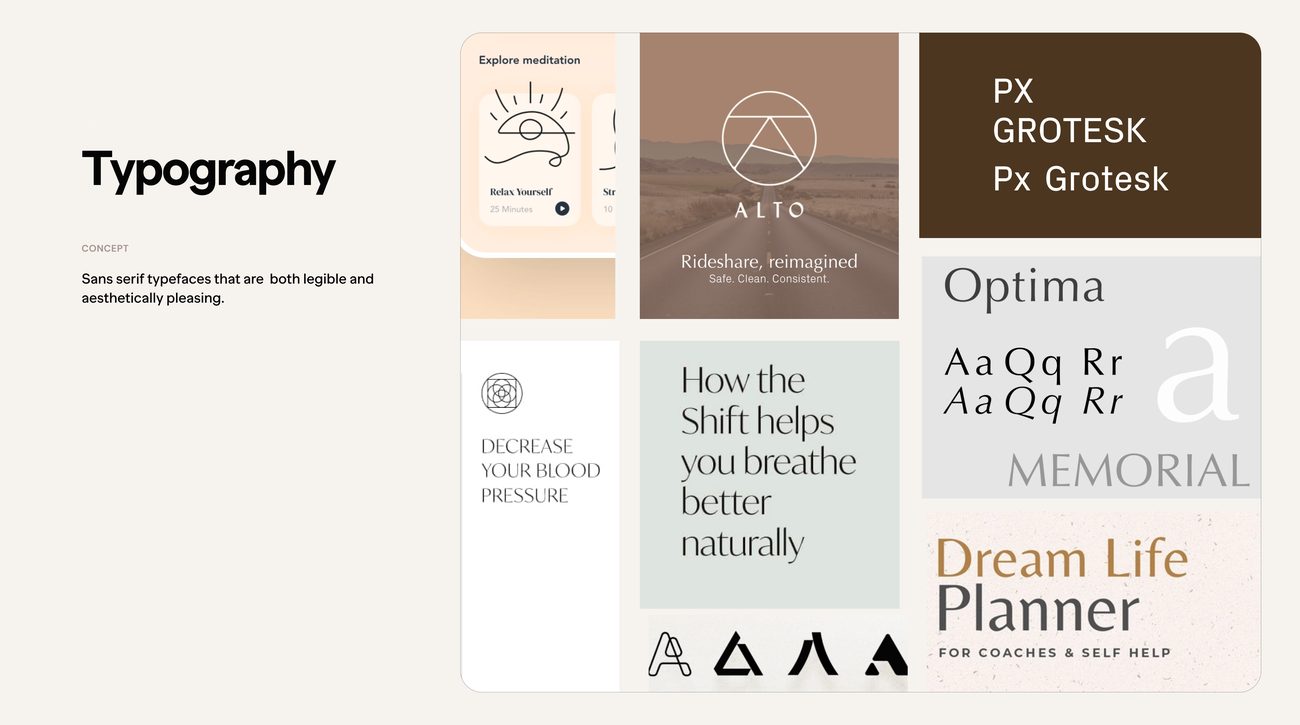
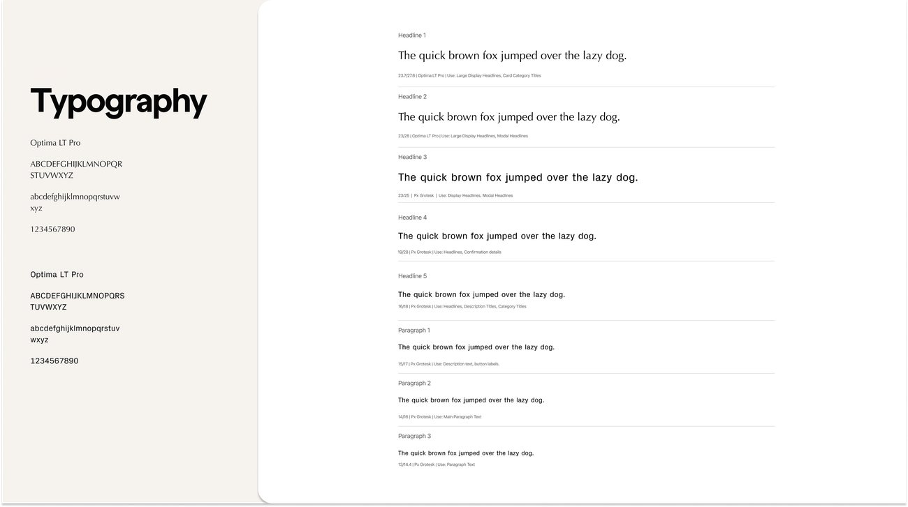
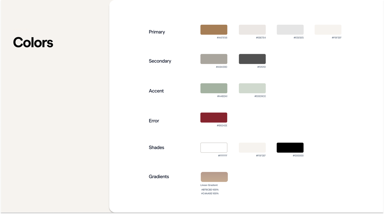
Utilizing my brand adjectives, I searched for inspiration and created a tranquil neutral color palette that reflected these words. For typography, I used a font that evoked the same feeling and was also legible at a small size.
The main difficulty I encountered during this process was creating an interface that contained calming, muted hues yet remained legible & aesthetically pleasing. After several color explorations, I opted to work with light neutrals as a base, injecting a darker primary color and accent color.
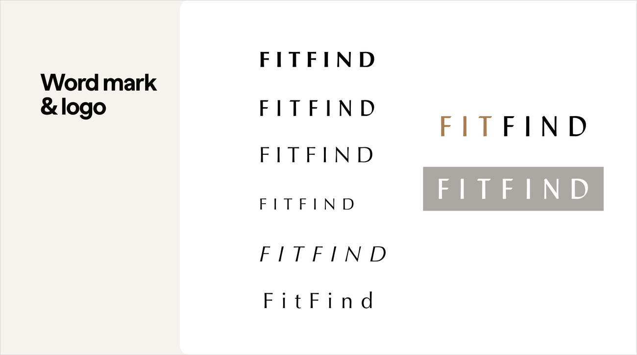
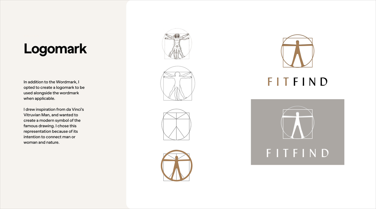
I iterated various wordmark concepts to come up with a logo that would resonate with my target demographic.
After defining my product brand and color palette, I applied these high-fidelity visual design elements to my final prototype. With numerous iterations, extensive UI exploration, and usability as my main focus, I present you with the high-fidelity solution:
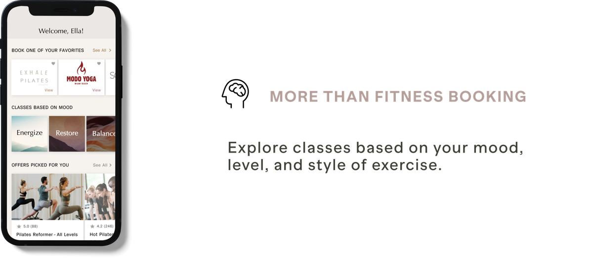
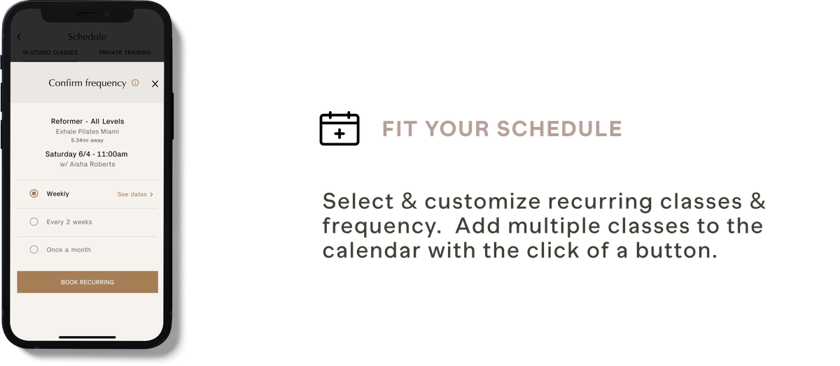
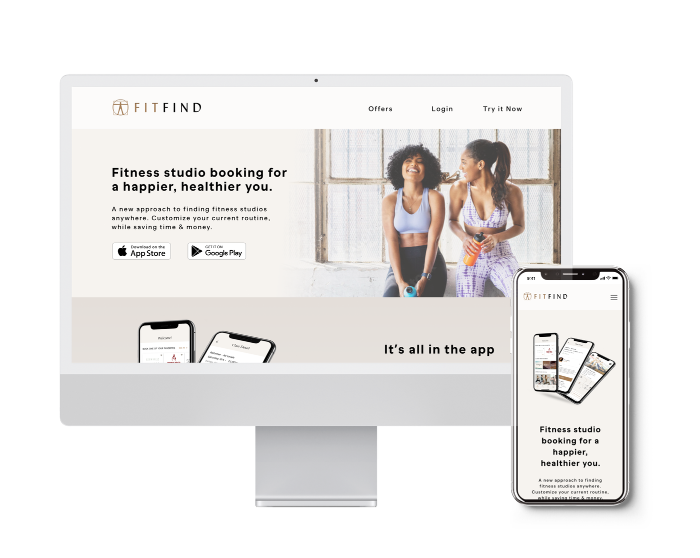
Next, I designed a responsive website experience promoting FITFIND.
I proceeded with developing a responsive marketing website and mobile version that focused on building a strong value proposition. The tone and narrative are meant to be supportive yet confident, appealing to my target demographic.
I gathered feedback after multiple iterations to ensure that the following goals were communicated:

Individuals are now more eager than ever to improve their physical and mental health through exercise post-pandemic. My research methods revealed there is a direct need to connect fitness patrons to in-person studio classes.
My design intervention impacts the way patrons search & engage fitness studios in their communities. This is crucial in order for these patrons to enhance their mental and physical well-being. Creating a product where fitness patrons can be connected to in-person fitness studios enhances participation within communities and increases overall motivation levels.
I personally chose this space to investigate because I worked as a Pilates & Yoga instructor in studios pre & during the pandemic. Witnessing this problem firsthand enables me to build a deeper empathy towards a proposed solution.
If the FITFIND app could be scaled with adequate financing, outreach and partnerships, users can benefit from the app not only when they travel; but locally, to discover studios within their direct communities.
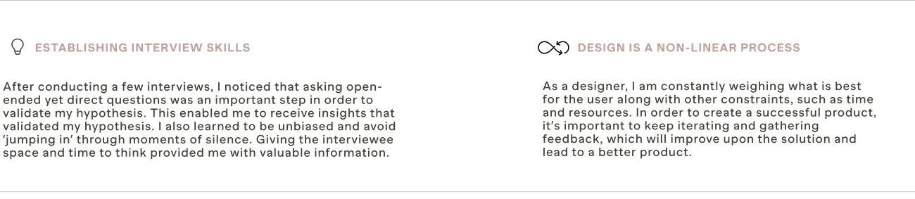
There were moments when I struggled with uncertainties, but having faith in the research and process of human-centered design was crucial in making it work. I found the process of allowing users to inform the design to be straightforward and refreshing, versus subjective-driven design. Throughout this process, I learned to separate myself from these designs in order to keep testing & iterating.
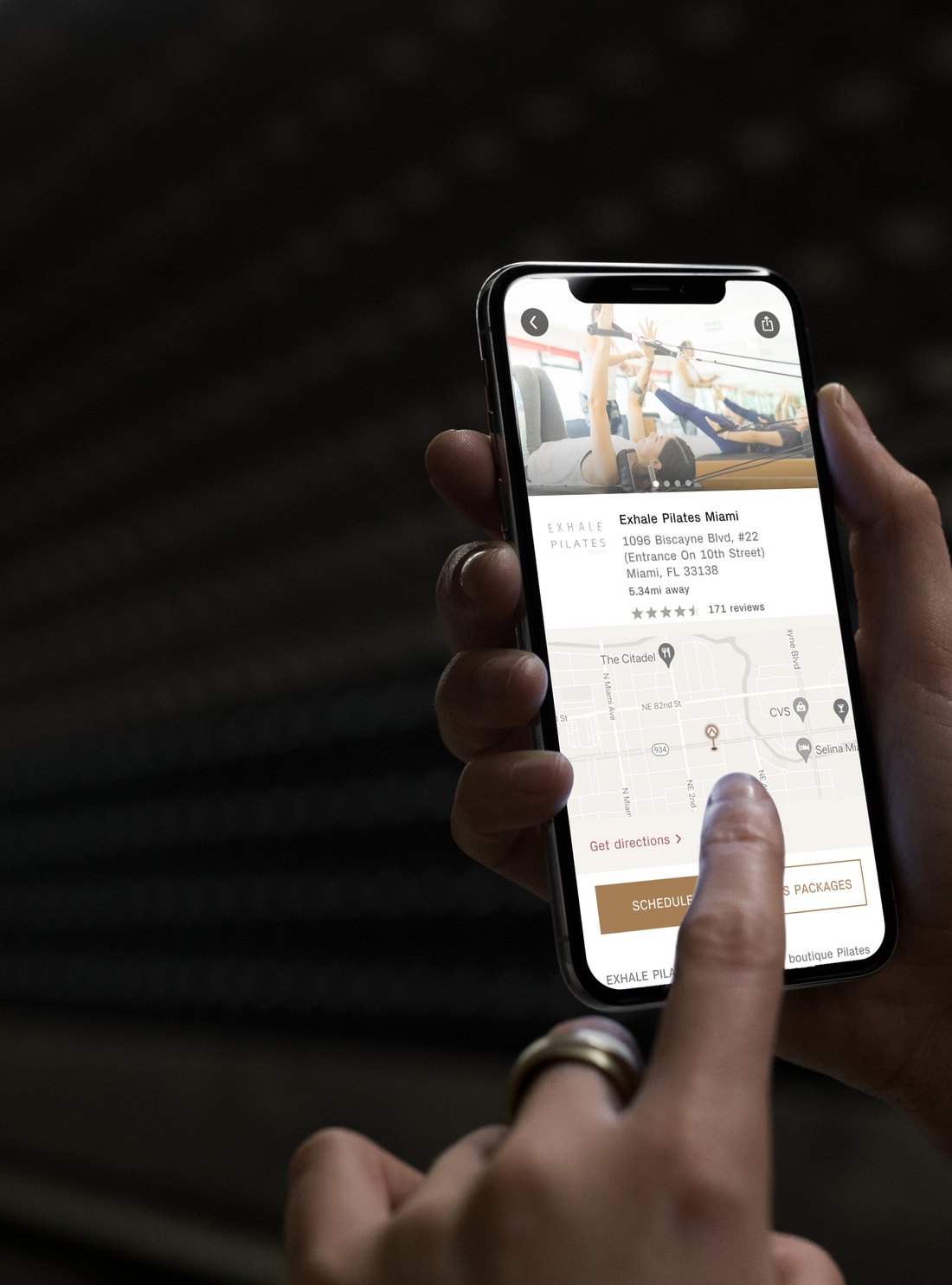
Although I received positive feedback after rounds of user testing, there is room to further explore features within the app. Throughout my interviews, I discovered that booking classes on behalf of a friend or family member and having the ability to invite others to class is a desired feature.
This feature would enhance relationships and enforce accountability. Another social component could be added, showing users who are attending class, the option to opt-out of showing attendance publicly. Expanded features also include Smartwatch integration to sync and track the way users exercise, and custom account preference screens based on the users booking history or data input.
Further research and testing should be conducted, as 4 months is not enough time to develop a comprehensive solution. It is also vital to gather additional key insights through primary research in order to improve the solution.